8 signs your website conversion rate sucks
Has it been ages since you last received an enquiry directly via your website? That’s the first sign that your website conversion rate sucks. However, before deciding what course of action to take we need to understand exactly what the problem is. It might be:
- Crappy website conversion rate
- Not enough website traffic
- Poor design
- All of the above.
Your analytics numbers are going to tell you a lot about website conversion but before we start pointing fingers there are a few obvious things that may well be missing from your website.
Essential Design Elements for Website Conversion Rate Optimisation
The website briefing process should always involve a discussion about business goals. Why? The whole point of having a website for your business is to attract and convert new customers.
There’s a bunch of numbers and analytics data that will help dive deep into website conversion analysis but if a few key design elements are missing then the numbers aren’t going to matter too much
1. Who you are and what you do is unclear
When someone lands on your website the first thing they’ll be looking for a few specific pieces of information. If they’re not immediately clear then they’ll be quick to bounce away. The first things a new visitor wants to know are:
- Can you solve the problem they have?
- How can they work with/buy from you?
- Are you trustworthy?
- What’s the next step?
If your website design doesn’t quickly address these elements then conversion is going to be an uphill battle.
The copy, images and flow of your website should work to present this information to a visitor clearly and efficiently. If your website isn’t achieving this then it’s time to consider a redesign.
HINT: Establishing a unique selling point (USP) for your business is important so that people remember you. However, never use clever copy at the expense of clarity.
2. Conversion points aren’t obvious
If you want people to take the next step towards working with or buying from you then you need to make it easy for them.
Your contact details and ‘About page’ need to be easy to find.
Some people will want to pick up the phone and call (yes those people do still exist). Others will be happy sending through an email or filling out an enquiry form. Depending on the size or type of service you provide users might expect to be able to book (and even pay) online.
Even though you don’t need to be personally contactable 24/7 your website should make it easy for people to get in touch with you at any hour of the day.
Think about when and where people are most likely to be researching your industry and ensure that it’s easy for them to take steps towards contacting you.
If you want people to sign up for a mailing list or regular updates from you then your opt in conversion points needs to be clear but not invasive.
3. No plan for attracting repeat visitors
Once you’re done the hard work to attract a new visitor you want them to return again. If you’ve got conversion elements in your website design then consider why people aren’t coming back.
On average it takes between 7-11 touch points with a business before a new customer or client takes action. If a visitor is only coming to your site once and not returning then it’s highly unlikely you’ll convert them into a paying client.
If your website is pretty static (AKA it’s rarely updated) then it’s unlikely that a visitor will return looking for new information. By publishing regular blog posts you’ll give a one off visitor more reason to return again.
Humans are a curious bunch, we like to explore stuff and the internet allows us to explore to our hearts content. If your website design doesn’t entice people to explore further then they’re not going to come back to dig a little deeper.
Regardless of whether you’re planning on running paid online advertising in the near future both your Facebook pixel and Google tags should be installed. These are small pieces of code that track visitors to your site.
4. Content is more about you than the user but your about section isn’t great
Did you know that the About page is usually the second most visited page on a website. That’s because we’re nosy buggers and want to know who we’re dealing with. As our interactions with people become increasingly digital there is more of an expectation for people to reveal more of their human side.
A great ‘About page’ has personality and established experience and credibility. Be mindful that whilst visitors come to your ‘About page’ to learn more about you they’re approaching it from a ‘what’s in it for me’ angle.
Likewise, copy on every page of your website must deliver what a visitor wants to hear not just what you want to tell them. If you’re going to the trouble of writing blog posts they should contain information that’s useful to your reader. Only publishing new content because you have something new to tell the world about your businesses isn’t a winning strategy. Visitors to your website want to clearly understand how working with you will benefit them.
HINT: Delivering website copy is often a major headache for businesses. At the very least your web designer should give you some guidelines. Better still they should be optimising it based on search terms (keywords) that will help you get found. Good web design agencies will be able to produce copy for you or work closely with a contract copywriter.
5. Navigation is difficult
Have you ever found a new website via search, started clicking around and couldn’t find your way back to where you started? Or you’ve arrived on a site and cannot, for the life of you, find the information you’re looking for even though you know it must be there somewhere.
Or, you’ve visited a site on your mobile that’s easy to navigate on desktop but it’s a frustrating pain in the backside on mobile. Some web platforms have limited menu options (Squarespace comes to mind here) making sites incredibly difficult to navigate.
The clear over clever rule is important when planning your website navigation. Use simple, straightforward terms to describe where a link will take a user. Buttons rather than text links are far easier for mobile users to click.
A slow load speed is another element of navigation that will adversely impact website conversion.
Using data to understand your website conversion rate
Assuming that your website design is all tickety boo the next step is to actually look at your numbers.
If you need a hand tracking them then check out our helpful resource here.
6. Low conversion rates
If your calculated website conversion rates are low then it’s obvious you’ve got room for improvement. Website conversion rate can refer to a number of different actions.
Visitor –> Lead (contact form submission, phone call, email enquiry)
Visitor –> Customer/client
Visitor –> Subscriber
You’ll also have conversion rates that strictly related to your website but, trust me when I say, it still has an impact.
Lead –> Customer/client
Click through rate (CTR) and conversion rate on paid ads.
Google analytics will give you all of the traffic information you could possibly want. Lead and customer tracking tends to be less straight forward for business that operate both on and offline. We recommend putting in place some internal processes to track where new business is coming from.
This blog post walks you through a traffic calculation to understand your website traffic and associated conversion rates. It’s the first exercise we go through with all clients because it quantifies where problems exist and identifies the best approach to tackling them.
7. High percentage of website traffic from a single source
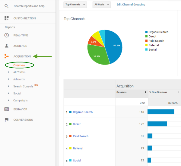
Analytics splits your website traffic into four buckets.
- Search
- Social
- Direct
- Referred
Paid ads are represented by subsets of search (EG Adwords) and social (EG Facebook). This information is easily accessed in your Google Analytics.
The majority of your traffic is coming from one source represents both a risk and an opportunity.
Risk, because traffic sources like search and social regularly change how they decide to rank content. If you rely too heavily on one source this can mean trouble for you if a change negatively impacts on the amount of traffic being sent your way.
Opportunity, because there’s a good chance you could be investing in another area to acquire more traffic to your website. Say you’ve got 80% search traffic and only a small percentage of social but you have a few thousand of likers and followers. You’re missing out on traffic.
On the flip side you may been regularly publishing blog content for a couple of years but you’re only attracting 20% search traffic compared with 60%+ social. This indicates your on page search engine optimisation (SEO) needs some work.
If your business has been around for a while then you definitely want to be seeing some direct traffic. Direct traffic is when someone types your website address directly into their browser.
8. High bounce rate/low number of page views/short time on site
Bounce rate is the percentage of your website visitors who navigate away from your site without clicking to another page. IE they view one page then leave.
Page views are (obviously) the number of pages that a visitor navigates to in a single session.
Time on site is, again, pretty obvious. It’s the amount of time that a visitor spends on your site in a single session. However, take this metric with a grain of salt because the time on site doesn’t take into account how long the visitor spends between their last ‘click’ on the site and when they leave.
Bounce rate, page views and time on site metrics need to be analysed in greater detail than sitewide averages. A thorough conversion rate optimisation analysis involves drilling down to understand how users from different sources are interacting with individual pages of your website.
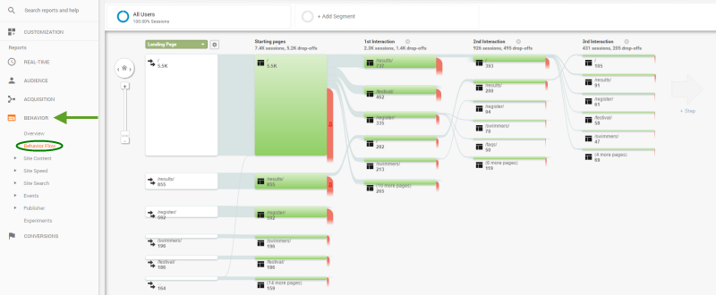
Google analytics produces detailed user behaviour flow charts. They’re really useful for identifying where any problems exist for finding opportunities for conversion rate optimisation.
HINT: Conversion rate analysis at this level is required when your design is good, you’re achieving a reasonable amount of traffic and getting regular conversions on your site. Unless you really love data this probably isn’t an exercise you’ll want to do yourself and you’ll need to work with your website design person to implement any changes. Growth driven website design is the process we use with clients to achieve continuous improvement on their websites.
How to fix bad website conversion rates
Once you’ve analysed your website and a identified why your website conversion isn’t great you’re ready to make a start on fixing it.
Improving website conversion rates won’t always require a complete website redesign. If your design already looks good then the first step will be a deep dive analysis of the traffic coming to your site. If your website traffic is on the low side then you’ll need to take steps to increase it to see what happens with your conversion rates.
We growth driven website design methodology with our clients. Growth driven design (GDD) is focused on continuous website improvement. Rather than going through a big overhaul every two or three years we make incremental changes based on real data. Every new website is built based on a combination of industry standards and best guess. The beauty of growth driven design is that your website is dynamic, just like your business.
If you’d like to be getting more business from your website we’d love to hear from you. Just shoot us a quick email and we can arrange a time to chat.

