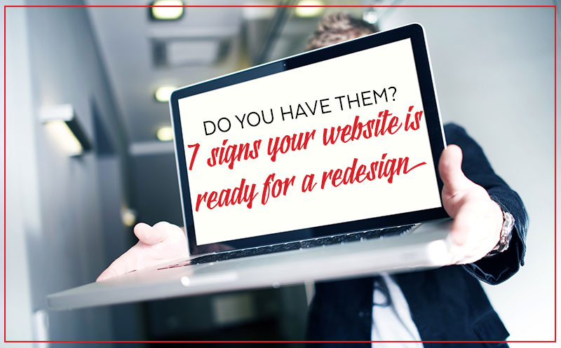
7 signs your website design is ready for an update.
We know the feeling because we’ve seen it plenty of times. You invested a hefty sum in your last website design and you’re still feeling the remnant effects of PTSD from the stress. BUT there’s a few things about it that don’t feel right anymore. Your business has changed in the last few years and your website doesn’t reflect that.
You’ve also got a niggly feeling that, despite all the cash you dropped, you’ve got no way of measuring what kind of results it’s achieved for your business.
How do you know when it’s time for a website redesign?
There are seven key elements of your website that you can assess to help you decide whether it’s time for a redesign.
1. Know Your Website’s Purpose
Do you know what purpose your website serves for your business?
If you don’t then there’s a good chance you missed an important step when your last website was built. The first step of good website design is defining business goals and understanding what part your website will play in achieving them.
A website should be more than an online brochure for your business.
Websites with great content and function will attract a higher number of business leads and shorten your sales cycle.
The first step towards knowing whether you’re ready for a new website design is to analyse whether your current website is serving its purpose for your business. Use our traffic calculator to evaluate whether your website is helping you achieve your business goals.
If the answer is no then it’s time to head back to the drawing board.
2. Your website must be clear
There are a few simple rules that we always stick to in our business.
Clear beats clever every time is one of those rules.
Every element on your website needs to be clear. One of the best things about a website is that it allows you to be considered in how you present your business. You don’t have to stumble through a face to face introduction and you can tell a visitor exactly the right thing at the right time.
Have a read through your website and get a feel for whether the copy and images clearly present a best first impression of your business. Here’s a few things to consider:
- Messaging must be focused, clear and consistent. A first-time visitor need to quickly understand why they should bother to stick around.
- The only place you should have large blocks of text is on your blog. All text needs to be easily scannable.
- Links should give the user a clear understanding of what they’ll arrive at when they click on them.
- Images need to honestly represent your business. Stock photos of the staff don’t elicit trust, people what to see the real faces of people in your business.
- The language and style of your website should offer a good representation of what someone would get if they met you face to face. Keep it professional, consistent and representative of your brand.
- Avoid industry jargon as much as possible. There’s a good chance that your ideal clients are searching for you using the same words you use to describe what you do.
An overhaul of copy and images on a website can be enough to update it without engaging in a full blown website redesign.
3. Good Website User Experience is Essential
Good user experience is a cornerstone of the difference between an okay website and a great one. When search engines crawl your site positive user experience tops the list of what they’re looking for.
Load Speed
Load speed is one of the top criteria search engines use when determining your organic ranking. If your website takes more than 3 seconds to load then search engines quickly drop it into a ‘poor user experience’ bucket.
You don’t need me to explain to you how frustrating it is when you click through to a website and there’s time to make a cup of tea while the site loads.
Mobile Responsive
Mobile responsiveness is another essential element that you need to be able to check off for positive user experience.
You know it.
You don’t need me to belabour the point.
If your site isn’t mobile responsive yet then it’s time for us to talk. You need to stop sticking your head in the sand on this one. Likewise, if you had a mobile version of your desktop site created to avoid the cost of having a completely new website built then it’s time for an upgrade. A mobile version of your desktop site isn’t doing you any favours either.
Considered user flow
The third aspect of usability I’ll add here is user flow.
When a visitor arrives on your site you want it to flow nicely for them. Delivering information in the order that they’re likely to be looking for it is really important. You also don’t want to ask for too much too soon. Welcome mats, splash pages and disruptive pop ups piss people off. It’s time to get rid of them.
Yes you should have opt in points for lead collection but it’s time for businesses to be more creative (and less disruptive) about how they do this.
4. Website Accessibility is important
Accessibility relates to how easy your site is to find and how easy it is to find information on your site.
Domain Name
An obvious, but often overlooked, aspect of accessibility is simply how straightforward your domain name is.
Web Design Adelaide might be a great exact match domain name but if it’s not your business name then people won’t remember it. Developing a series of basic sites on exact match domains can be useful from a search engine optimisation (SEO) perspective.
However, multiple websites give you more to maintain and update and spreads your traffic. Multiple sites can also cause brand confusion and make it more difficult for a visitor to find you again. Attracting all your traffic to a single, regularly updated site is going to benefit you more than multiple exact match domains.
Long URLs are easy for people to get wrong and names with deliberately misspelt words are hard to get right.
Words
Once a visitor has found your website consider how easy it is for them to engage with it. Most people will need to read your site so it’s essential that your font size and style is easy to read for an average user. Erring on the side of slightly too big it preferable to text that’s too small.
Sans serif fonts are generally considered easier to read than serif. Cursive and other decorative fonts should only ever be used for headings. Don’t underestimate how important font selection is, it contributes up to 80% of how your brand will be perceived.
How you write for screens is most likely different to how you were taught to write in high school English. Sentences should be shorter and a paragraph longer than three sentences is too long.
Text needs to be scannable, to the point and easy to understand.
If your business is likely to attract people who speak another language then you should have a translate function. Some businesses have clients that are likely to find reading difficult. This can be addressed with text to speech functionality on your website.
Search
Every website should have search functionality that’s both easy to find and use.
On page search is a feature that is more likely to be used by returning visitors when they want to return to something they’ve seen previously or dig deeper for more information.
5. Your website is about the user, not you
The number one problem we encounter is a lack of user focus across a client’s online presence. When developing any digital asset, whether it’s your website, social media content or email marketing collateral your first thought needs to be about the user.
What do your website visitors want?
If can’t answer that question then you’ve got a problem.
When a new visitor lands on your website they quickly need to understand:
- Audience – Who you work with
- Benefit – The problem you solve for your clients
- Feature – How you work with people.
Your elevator pitch should already nail these three things. Same as you’d use it to introduce your business in person it should be front and centre on your website.
Have you noticed something missing from that list, who you are is not the first thing people want to know. Once they understand that you offer the services you provide the next thing they’ll want to know is who you are.
Where you DO need to feature on your website
Your home page needs a short introduction about your business and any key players. Your about page is where the killer meet and greet info needs to go. Even though your about page is there to introduce you and your business, remember that it needs to be about the person reading the information.
Your about page is needs to give a user the information they want to know, not what you want to tell them or think they need to hear.
Same as in real face to face interactions we’re going to bond with someone over common interests and develop trust faster than because of their qualifications. A real person wants to read a snippet of your story, not the professional bio you’d put at the end of a technical conference paper.
That’s old school and difficult to relate to. A website visitor who is considering using your service wants an insight into your human side.
Having answered your user’s key questions
- Why am I here?
- Who are you?
The last thing your website needs to do is give a visitor something to do next. Assuming you’ve ticked some boxes for the user how well you execute the ‘what next?’ step will impact on conversion rate.
Your website design needs to clearly communicate what you want the user to do next
Depending on what stage of the decision-making process a visitor is at you’ll need to offer a few different conversion options. A new visitor will be at one of three stages in their journey towards buying a product or engaging a service:
- Awareness
- Consideration
- Decision
At each stage a website visitor will be looking for different things. A user who is doing research because they’re only newly aware of their problem isn’t likely to be ready to book an appointment so if that’s the only conversion option you’ve got then they probably won’t stick around or come back.
If it’s not easy how to book in or buy from you then visitors who are ready to engage your services won’t convert.
Websites that are devoid of all but the bare minimum of information can’t adequately address user needs. How much a user wants or needs to know in order to make a decision varies wildly between industries. What’s important here is that you know what your ideal client needs to know and you provide that information.
In a nutshell, if your website design isn’t user focused then your conversion rate will suck.
6. Website navigation needs to be straightforward
Last year we launched a new website for a sporting club. Users loved how easy it was to navigate between pages on their phones because we gave them big buttons to click.
The old website was mobile responsive but all the links were in text or hidden in extensive drop down menus. Not ideal for an audience who were often trying to locate information while at the pool or on the beach.
Website navigation in a nutshell:
- Seven top level navigation items (or less)
- Avoid extensive drop down menus
- Make sure that your website architecture is well defined (if you just went huh? Then we need to talk)
- Remember that an increasing number of your website visitors are using their phones
- Links in text need to be obvious
- Give people a button rather than a text link to click whenever possible
- Make it easy for people to search your site
- Ensure that link descriptions are clear so what visitors land on is close to what they were expecting to find
- Clean up broken links
- Does the flow of your website pages match the expected intent of your user
There are great tools available for analysing how users are actually interacting with your site. Gaining an understanding of what’s working well now (and what’s not) is helpful in understanding:
- Whether a website redesign is necessary
- Where improvements on your existing design could be made
If you’re not sure where to begin we can complete a website navigation audit for you. Once the audit is complete you’ll have important data that will help you decide whether it’s time for a website redesign. Send us an email to get the process started.
7. Website appearance is important but it’s not everything
How a website looks is one of the hardest things to resolve between client and designer. Elements that each of you could spend hours agonising over (I’m looking at you typography) mean nothing to your website users.
How easy the site is to read and navigate are way more important to the user than whether you choose Raleway, Montserrat or Times New Roman. A visitor doesn’t care that green you chose isn’t quite the perfect shade. Because the perfect shade is only perfect to you.
The appearance of your website must be a delicate balance between:
- The things that define your unique points of difference and
- What your ideal client’s expectations are of the business they want to work with.
If your website’s appearance deviates too far from what’s expected in your industry then you’ll have to work much harder to gain trust.
Appearance is important but what appeals to you isn’t always going appeal to your ideal customer or client. Clean lines, classic fonts, clear copy and great photos are the most important elements for a website design that doesn’t date quickly.
If you’re considering a website redesign then you should also think about whether your branding needs an update. If your branding has changed but your website hasn’t been updated then it’s definitely time for a redesign.
It’s important that your website is aesthetically pleasing to your ideal customer but investing in too many fussy design elements isn’t a great investment in the long term.
Is your website design ready for an update?
After casting a critical eye over these seven important elements of your website you’ll have a good feel for whether it’s ready for an update.
If you’ve got some questions feel free to shoot us an email and we can cast an eye over your website for you.
Our website design process is different. Once you get started with us you’ll never have to start over from scratch again. After making the first round of improvements we implement an ongoing continuous improvement process. This means you’ll end up with a high performing, lead generation machine.
Click here to learn more about our growth driven website design process.
Great article guys! I agree on every point here. Don’t want to be a stickler but I noticed a typo (serif vs SANS serif) oh man I am sounding like a client 😉
LOL…thanks Sam!